 Have you ever wondered who it is exactly that proclaims the color of the YEAR? I mean, who has enough global influence to ensure that almost every item from fashion to interior design is seemingly produced from the same color palette with very minimal deviation? Even if you’ve never taken the time to wonder specifically about it, I’m sure you’ve at least noticed how in any given year there are certain hues that are everywhere… prominent in your favorite clothing stores, featured in interior design magazines, gift wrap, paint, and the list goes on and on. Some years, the fixation on one particular color can get so overwhelming you almost wish you never saw that color anywhere again. In 2009, for example, I experienced what I deemed a “mustard yellow crisis” from which I’m still recovering.
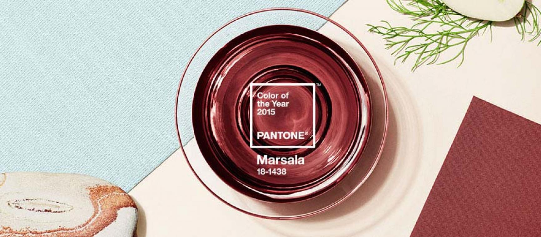
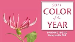
Come to find out, PANTONE®, the revered global authority on color, releases a “Color of the Year” for each upcoming calendar annum. Now, although I was pretty disgusted and could show absolutely no love to what they called “Mimosa” in 2009, I have to admit I’m game for the vibrant and uplifting shade of pink they’ve dubbed “Honeysuckle” for 2011. In fact, as soon as I lay eyes on the chosen color of the year (PANTONE® color 18-2120, to be exact), this dainty (and admittedly suppressed) persona from deep within whispered “now that’s Pretty in Pink.”