

Smart Meetings recently posted the “Five New Meeting Trends to be Aware of” including:
Smart Meetings recently posted the “Five New Meeting Trends to be Aware of” including:
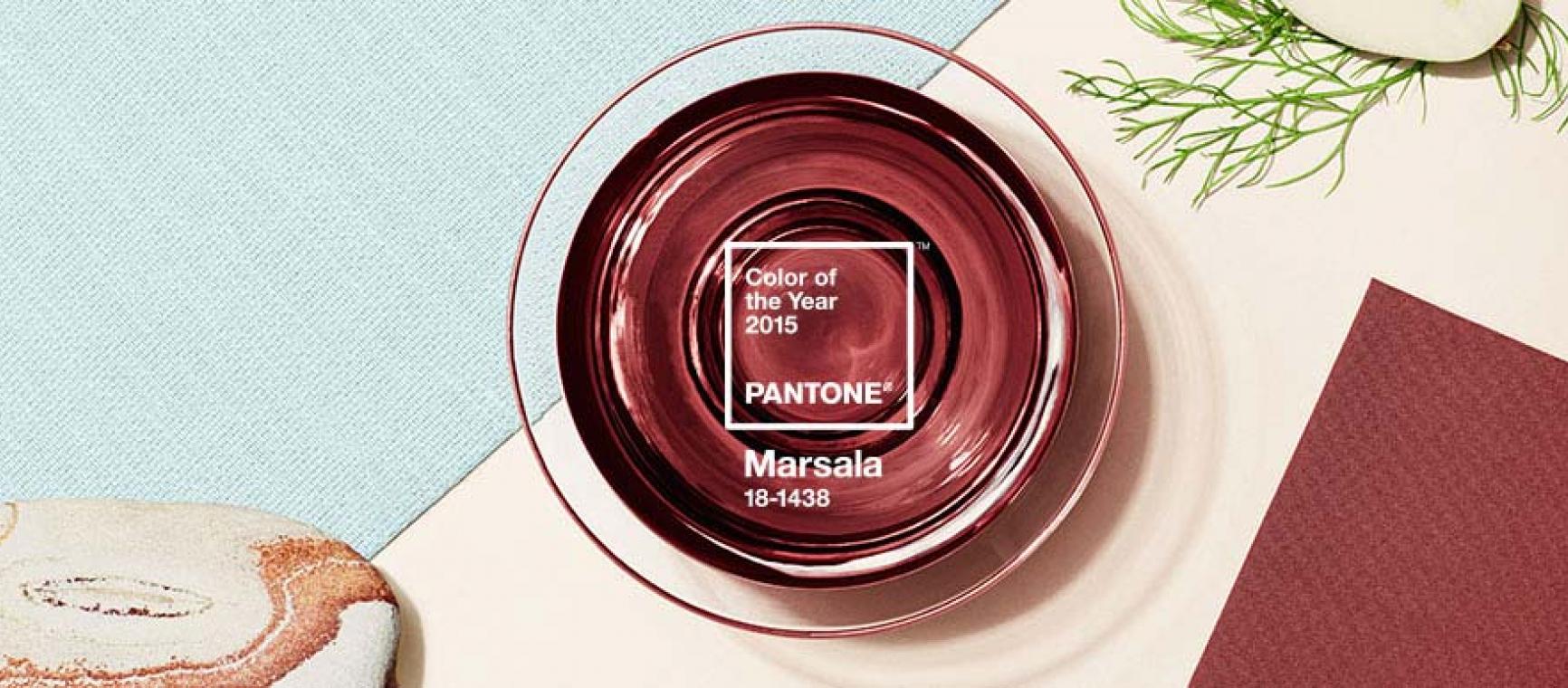
If there is ever a month that has a color that is almost symbolic of that month, it’s February and the color red.
But in 2015, it’s not just red. It’s Marsala, and that is our first trend to watch.
“A naturally robust and earthy wine red, Marsala enriches our minds, bodies, and souls.”
January doesn't usually see a lot of love: it’s cold, it’s a reality check after the downtime we get with holidays in November and December, it’s cold, it’s a month we set (and usually break) resolutions, it’s cold, you get the idea. But, there is something that January offers that we look forward to all year: spending some time checking out what the latest events trends are for the year and deciding which we are going to follow and build into the events we are planning!
Booking meeting space by the hour, free Internet, Xbox 360s, apps for changing room temperature, build-your-own-trailmix, and mojito bars. Hotels across the country are rolling out new amenities and features to lure business travelers and meeting/event business.
Check out this recent article on USA Today to learn how hotels are getting creative to lure groups and business travelers.
We are seeing a new trend in the events industry: very short lead times! Sure, we have some clients that typically have 12-18 month planning cycles (we love that!), but we are now seeing most events with a 90 to 120 day lead time. Every meeting planner we know will freely admit to loving the long planning cycles and loathing the short lead times, but we know (secretly, of course!) that most of us also thrive on the intensity and challenge of planning those quick-turn events too.
We’ve been reading a lot of predictions about event trends for 2013, and most seem to center around wedding trends.
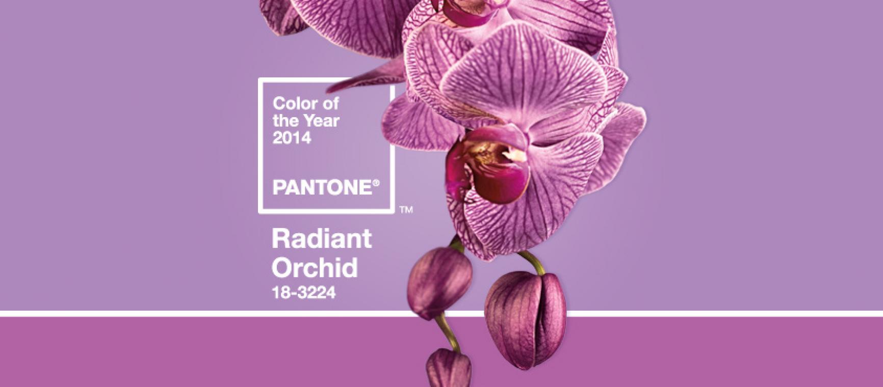
 Have you ever wondered who it is exactly that proclaims the color of the YEAR? I mean, who has enough global influence to ensure that almost every item from fashion to interior design is seemingly produced from the same color palette with very minimal deviation? Even if you’ve never taken the time to wonder specifically about it, I’m sure you’ve at least noticed how in any given year there are certain hues that are everywhere… prominent in your favorite clothing stores, featured in interior design magazines, gift wrap, paint, and the list goes on and on. Some years, the fixation on one particular color can get so overwhelming you almost wish you never saw that color anywhere again. In 2009, for example, I experienced what I deemed a “mustard yellow crisis” from which I’m still recovering.
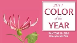
Come to find out, PANTONE®, the revered global authority on color, releases a “Color of the Year” for each upcoming calendar annum. Now, although I was pretty disgusted and could show absolutely no love to what they called “Mimosa” in 2009, I have to admit I’m game for the vibrant and uplifting shade of pink they’ve dubbed “Honeysuckle” for 2011. In fact, as soon as I lay eyes on the chosen color of the year (PANTONE® color 18-2120, to be exact), this dainty (and admittedly suppressed) persona from deep within whispered “now that’s Pretty in Pink.”